CD & ADVERT LINK ANALYSIS
USE OF TEXT
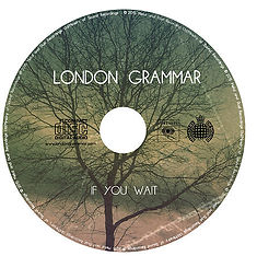
In our advert and digipak, I have made sure that the font and colour of the text is the same where appropriate. For example, on the front cover of the album, I have included a font from "dafont.com", in which I had to download and install. The font is called "Minimal" and is in white. Following on from this, I have continued the same colour and font onto the CD where the title and album name have remained the same (along with a similar format - London Grammar being at the top, If You Wait being at the bottom). Alongside this, the same font and colour has been continued onto the back of the album and the magazine advert. By keeping these the same maintains a continuous housestyle, which enables the audience to recognise the genre and artist. We liked the font "Minimal" because it fits the indie pop genre, it looks professional and it is easy to read.
LIGHTING AND EFFECTS
One most promiment feature that is noticed in our digipak is the lens flare. This creates depth and professionalism. I put this on the front cover of the digipak because it fits with the background and it is placed in the sky, which makes it look like the sun reflection. Again, this can be seen on the back of the digipak, where the lens flare is placed in the sky. I did not include the lens flare on the magazine advert because there would be no need to have one coming from the artists face and it would not look real. Alongside the lens flare, I included a gradient consisting of mainly green, orange and purple. This makes the digipak look professional and shows the audience what type of genre the album is. Also, the colours to not overpower the digipak, it enhances it and makes it stand out from other albums. This gradient effect has been continued throughout the CD, inside of digipak, back of digipak and the magazine advert. This enables the audience to recognise that all of these elements come from the same artist along with maintaining the housestyle.
REPRESENTATION OF ARTIST/BAND
Due to the guitarist and drummer being less insignificant than the main singer, who was almost always in shot in the music video, means that we included just the main singer in the digipak and magazine advert. Also, it is not as if we were just promoting the main singer because we only included them inside the digipak and the front cover of the magazine advert. The reason behind putting the artist inside the digipak rather than on the front is because we thought it would make the audience want to know more about the band. This would be shown as they open up the album. The main singer has her eyes closed because we thought it would represent her being thoughtful and quiet, which reflects on the nature of the songs. This is because the songs are fairly ambient and are not very lively. It shows that the main singer is not as outgoing as pop singers because they tend to be confident and exuberant. The singer is against a brick wall because it would look unprofessional against another colour such as white, or green. Also, it suits the rest of the muted tones in the digipak and music video.
Vicky Pike